Team: Executive Creative Director, Associate Creative Director, Senior UX Designer, Associate UI Designer, Associate UX Designer
Timeline: February 2024 - March 2024
Tasks: Full Website Heuristic Analysis Report, Competitive Analysis Report, Wireframes, High-Fidelity Mockups
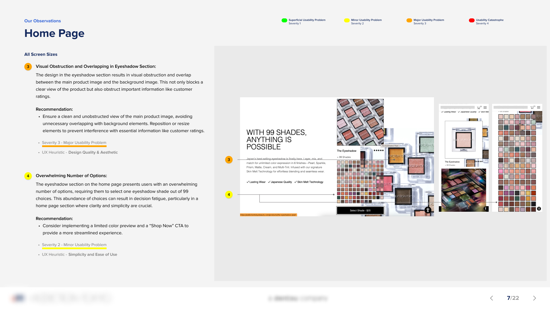
Tools: Figma
Our potential client was a makeup brand recognized in Japan for its edgy, high-fashion, and high-quality products. They launched in the U.S. approximately a year before approaching our company, as they had not achieved the desired market impact. A key priority for them was to establish a stronger connection with their American audience while preserving the unique identity and essence that defined their brand.
Our team was tasked with delivering a comprehensive website heuristic analysis report, a competitive analysis report, and high-fidelity mockups—all within a one-month timeframe. Given the tight deadline, clear and effective communication was crucial to keeping the team aligned and producing high-quality deliverables for the client presentation. Since this project was a client pitch, it was essential to differentiate ourselves from competitors by thoroughly addressing the client's needs and exceeding their expectations of what our company could offer as a potential partner.
The Senior UX Designer and I were given one week to complete a comprehensive website heuristic analysis before presenting to the internal team. Our findings, along with the key insights from the competitive analysis, would inform the final design screens.
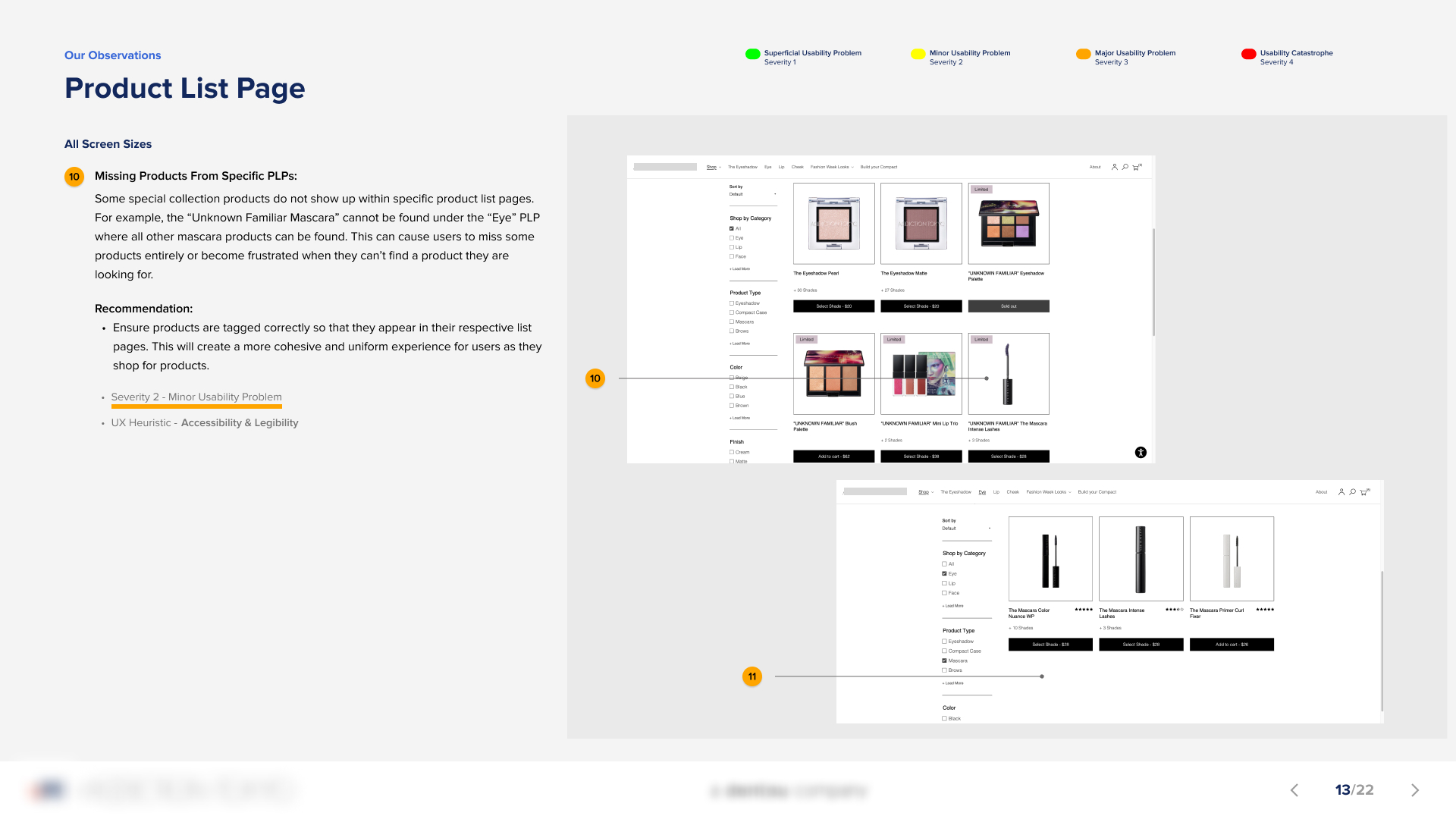
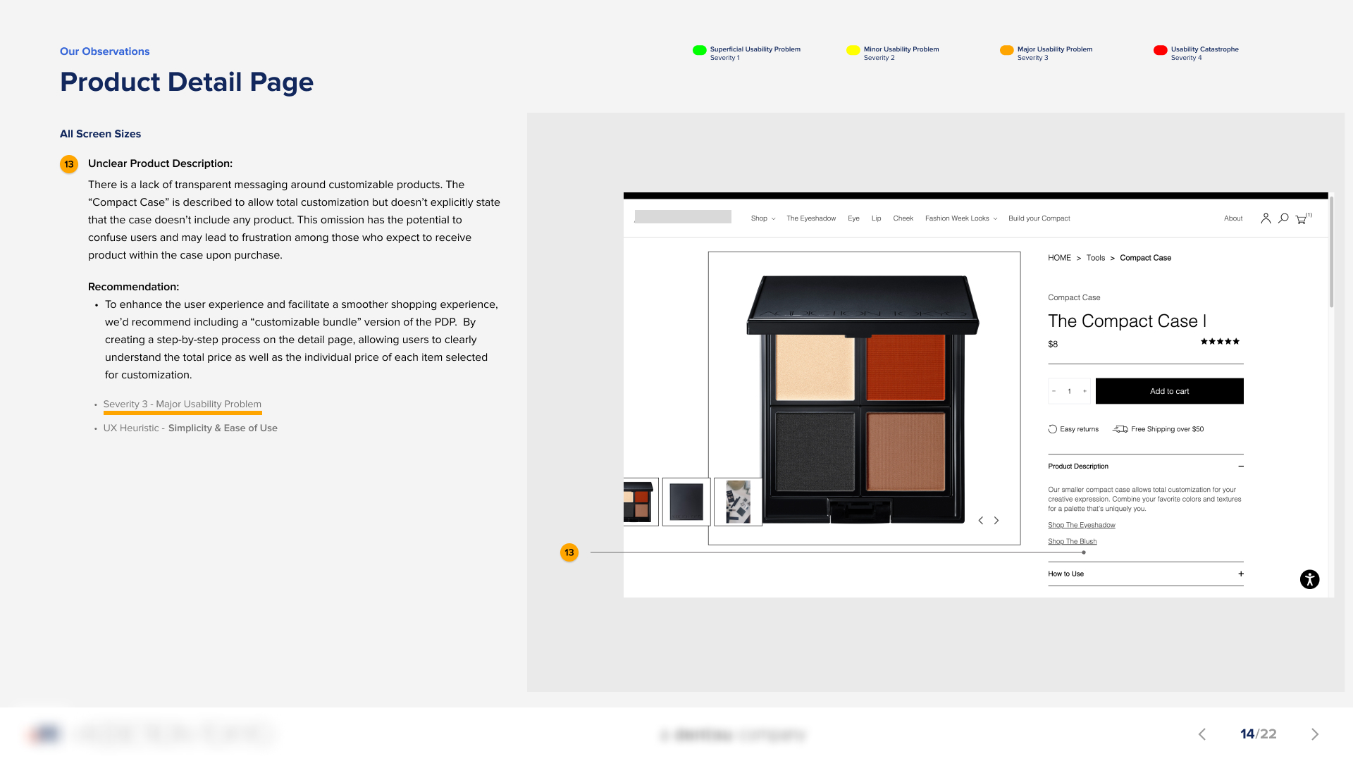
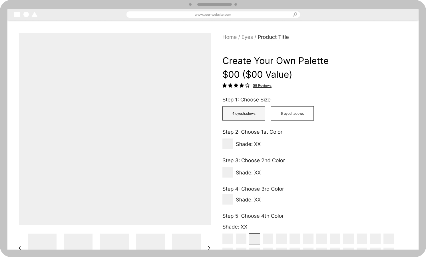
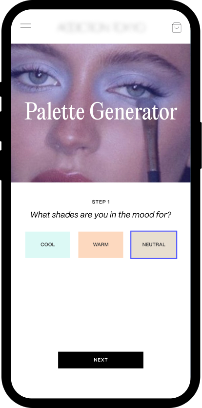
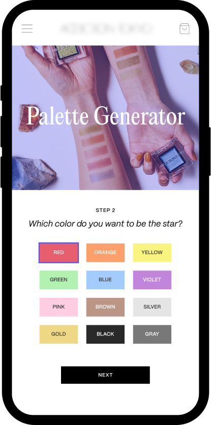
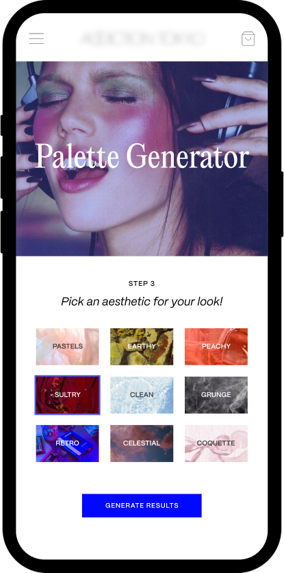
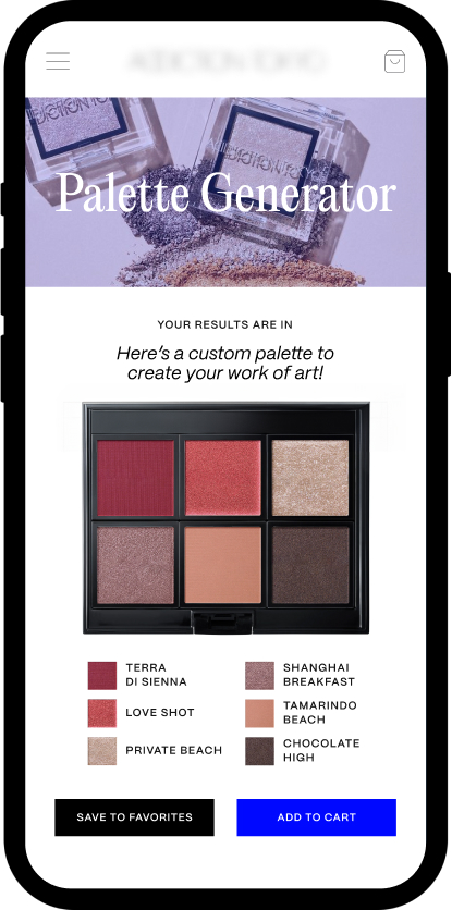
In total, we identified approximately 20 usability improvements. While many were minor issues that users could easily navigate on their own, we discovered several behaviors that most users might find unfamiliar. For example, two of the brand's popular products were a customizable palette and an eyeshadow available in over 99 shades. We found that the customizable palette was sold as an empty case, requiring users to purchase individual eyeshadows or blushes separately to fill it. This could cause some user frustration since it was not abundantly clear that the compact case was empty. This insight led us to propose a unique user journey and detail page for the customizable palette to better capture users' attention and improve their experience.
COMPETITIVE ANALYSIS
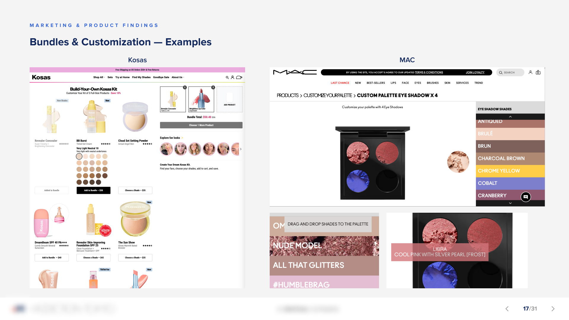
While conducting the heuristic analysis, I also assisted the UI designer with the competitive analysis by researching popular makeup and skincare brands in the U.S. I focused on key elements such as homepages, navigation, product detail pages (especially bundles), and palette generator pages to identify opportunities for improving the detail page designs of their different products.
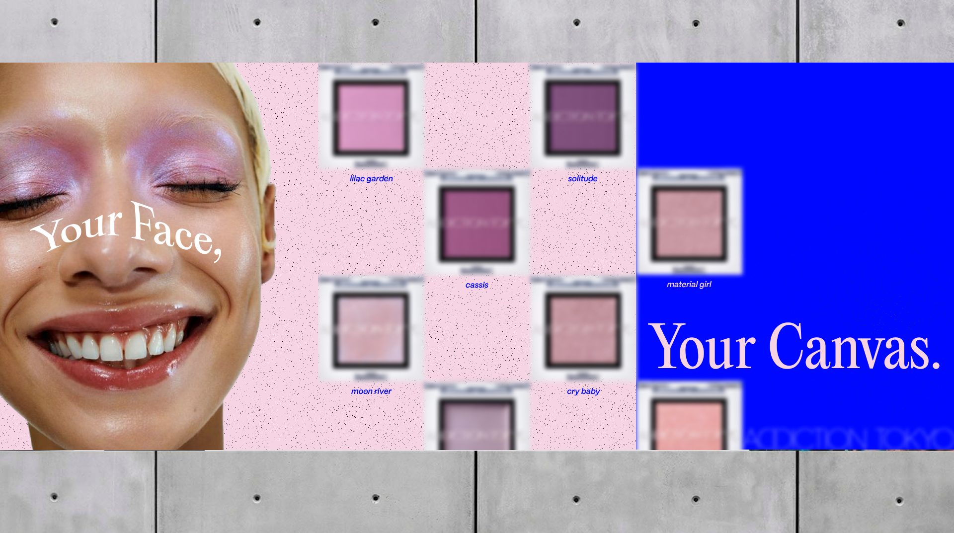
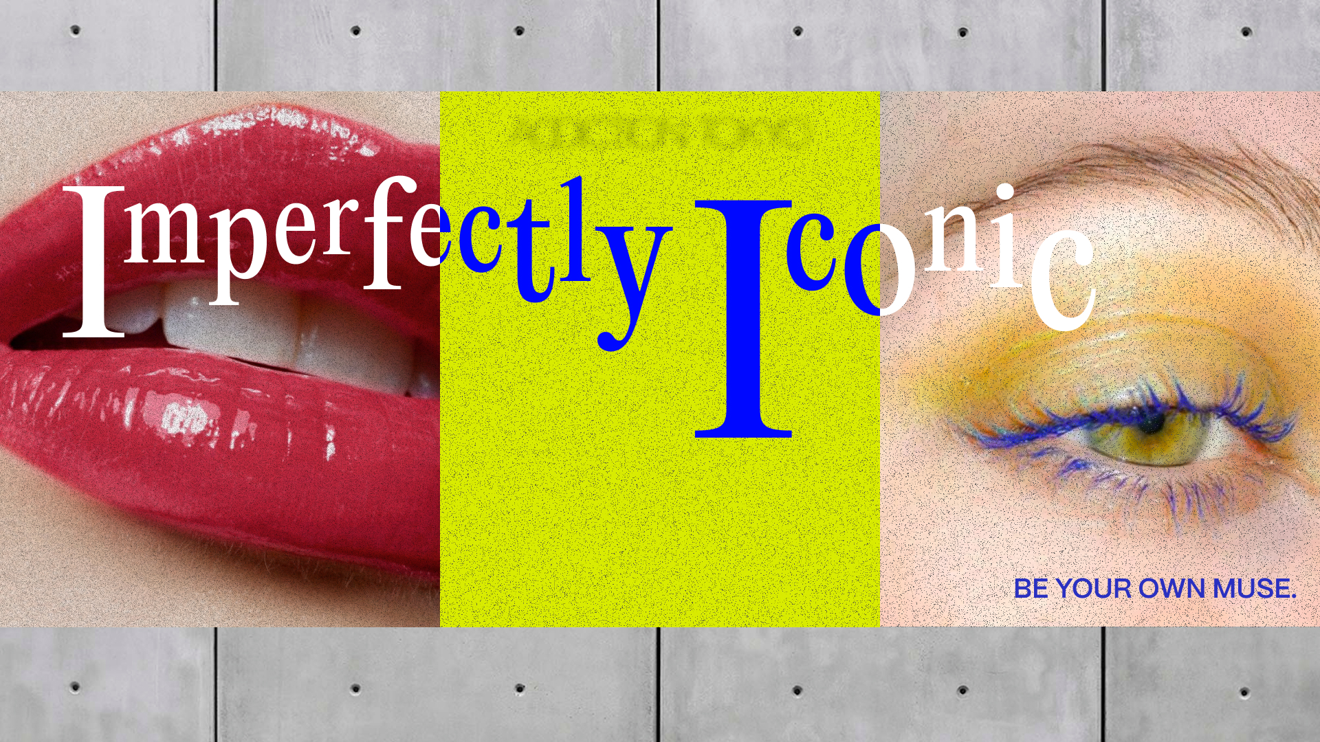
During this process, we also examined current trends in the industry to help the UI Designer and Associate Creative Director develop distinct brand identities. Our research revealed that many U.S. makeup and skincare brands were currently emphasizing a "clean look" that celebrates natural beauty and minimal makeup. This trend contrasted with our client's high-fashion and edgy brand identity. To strike a balance between these visually different styles, the Associate Creative Director and UI Designer developed three distinct creative directions, providing our client with options for how each approach could be translated into a website redesign.
Design
WIREFRAMES
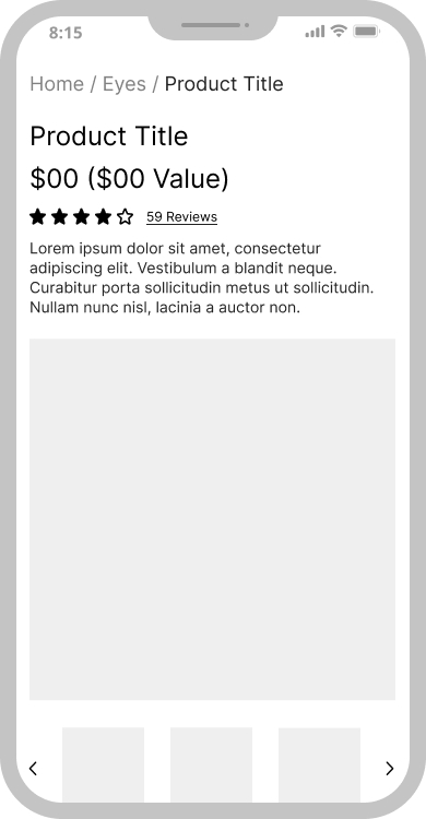
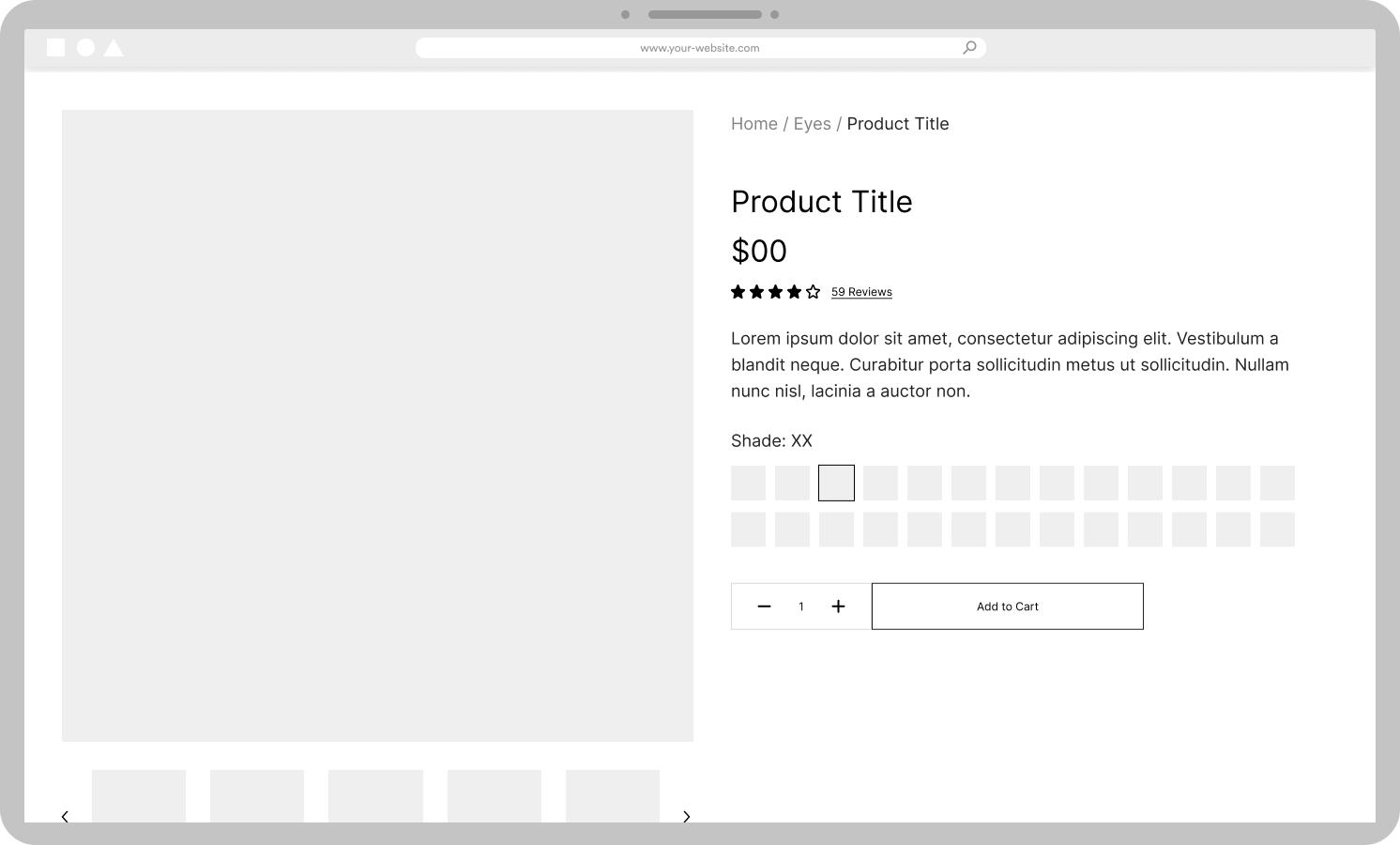
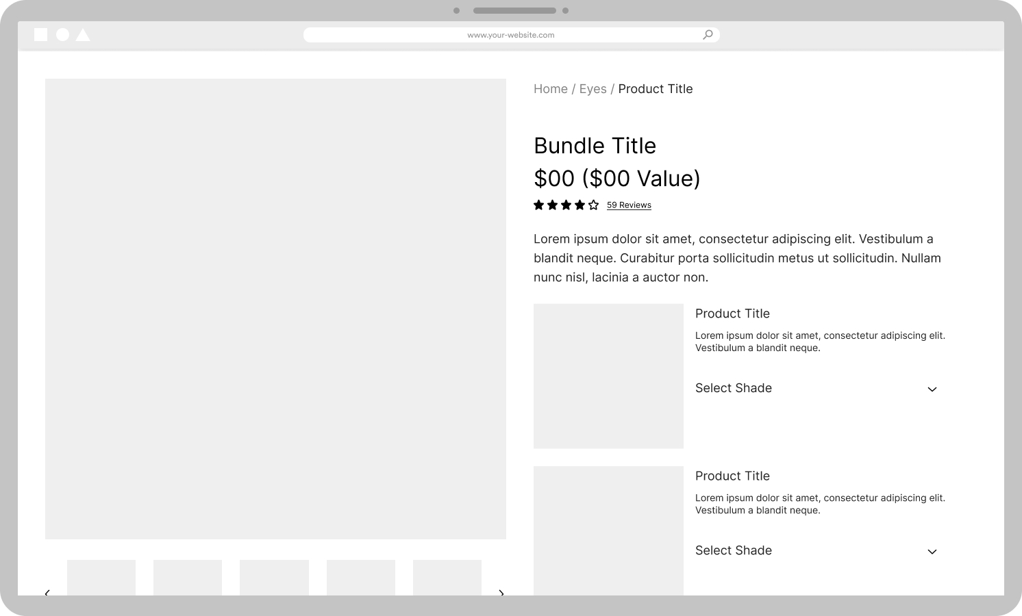
With the heuristic and competitive analyses completed, I developed wireframes for the homepage, header/navigation, a product listing page (PLP), and three product detail pages (PDP). Our team aimed to provide comprehensive options for the product detail pages, demonstrating variations that could accommodate the different types of products.
My focus was to ensure that the various PDPs would be intuitive, allowing users to easily understand the type of product they were viewing. Since the existing detail pages had caused confusion about what was included with specific products, my goal was to create a clear and guided user experience that facilitated seamless navigation.
These wireframes also provided the visual designers with a foundation to begin creating high-fidelity mockups, applying their creative direction to the layout I had established.
HIGH FIDELITY MOCKUPS
After receiving feedback on their three creative directions, the visual designers were prepared to create the high-fidelity mockups for our final presentation to the client.
During the high-fidelity phase, our team discussed strategies for creating a more distinctive website that would capture the attention of the U.S. market. Following the competitive analysis, the UI Designer and I proposed the idea of a quiz that would generate a customized palette based on the customer's responses. This concept ultimately replaced the product detail pages that I had initially wireframed, given the limited presentation time with the client. We decided that presenting a product quiz would effectively demonstrate a unique, engaging, and intuitive user journey that highlights their most popular products.
Key Takeaways
1. ALIGNING BRAND IDENTITY AND MARKET TRENDS IS CRUCIAL
I learned the importance of balancing a brand's unique identity with the preferences of a new market. While working on the Addiction Tokyo project, I realized that maintaining the core essence of the brand was essential, but we also needed to adapt to local market trends to resonate with the target audience. Presenting multiple creative directions allowed us to explore how we could evolve the brand without losing its distinctiveness.
2. DESIGNING CLEAR USER JOURNEYS IMPROVES EXPERIENCE
I recognized that a clear and engaging user journey is key to a positive user experience. By identifying confusion points in the existing product detail pages, I focused on designing intuitive paths that guide users through the experience. I also discovered that incorporating interactive elements, like a product customization quiz, can make the user journey more engaging and memorable, particularly when trying to differentiate a brand in a competitive market.
3. RESEARCH LEADS TO BETTER DESIGN
I learned that thorough research is fundamental to effective design. Conducting heuristic and competitive analyses gave our team insights into usability issues and market trends, which directly shaped our design strategy. This process highlighted the value of using data to drive design decisions, ensuring that our solutions were both user-centered and aligned with the client’s business objectives.