TEAM
- Associate Creative Director
- 3 Senior UX Designers
- UX Researcher
- Associate UX Designer (Me)
TIMELINE
May 2023 - Nov 2023
TOOLS
Figma, FigJam
METHODOLOGY
We kicked off the project with a competitive analysis, reviewing visual hierarchies, calls-to-action, branding, and layout patterns used by competitors. This helped us understand both industry standards and opportunities for differentiation.
FINDINGS
PERSONAS
While we didn't formally create personas, we consistently designed with two primary audiences in mind:

CHALLENGE
During our initial research presentation, we noticed signs of impatience from the client. After a conversation with our internal team, we realized that they had likely heard much of this information from the previous agency. While the research was still valuable to us, it became clear that the client was eager to move forward and see tangible process.
SOLUTION
We pivoted quickly by proposing design discussions using FigJam as a middle ground. This allowed us to initiate visual exploration early while keeping expectations grounded. We made it clear that these were just explorations, not final solutions - which helped manage pressure on both ends. It gave us a better sense of their preferences while continuing to build understanding and alignment.
IDEATION & CONCEPT DEVELOPMENT
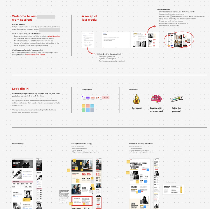
We hosted collaborative design discussions using FigJam, starting with the homepage to establish the tone and visual direction. Two initial concepts were presented:
The client preferred a blend - the color blocking and dynamic graphics of Concept A, combined with the cleaner, more editorial photography approach of Concept B.

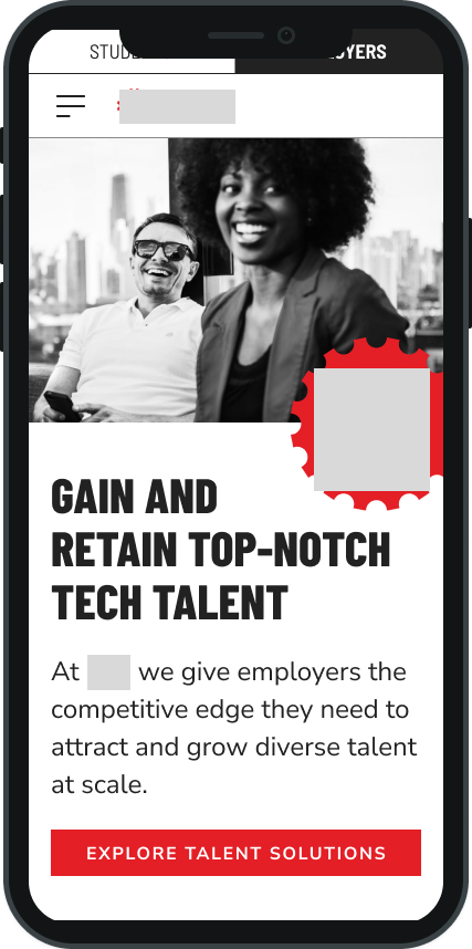
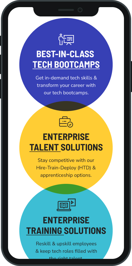
DESIGN EXECUTION
We worked on both desktop and mobile experiences, focusing first on the B2B site, followed by the B2C experience. We created a new brand guide to ensure visual consistency across both.
WIREFRAMES
Each design drop began with wireframes to present layout logic and gather client feedback. We emphasized best practices in UX and accessibility to justify our decisions.
PROTOTYPES & HI-FIDELITY DESIGN
We iterated on hi-fi mockups after feedback on wireframes. Typically, each section underwent:
CHALLENGE
One complexity during the design phase was the size and background of the client team. With multiple stakeholders across departments - all with slightly different goals - it became clear that internal alignment wasn't always in place. On top of that, several stakeholders had backgrounds in UX and visual design, given the company's deep roots in the edtech and design education space.
SOLUTION
We made a point to present our work with clear UX rationale, referencing best practices and accessibility principles to support our decisions. This helped us ground discussions in objective reasoning rather than subjective preference. We also used wireframes to focus conversations on layout and logic first, before visuals could create bias. While feedback was often layered and at times conflicting, we stayed consistent in our communication and created space in meetings to clarify priorities - making sure no voice was ignored, but no design was derailed.
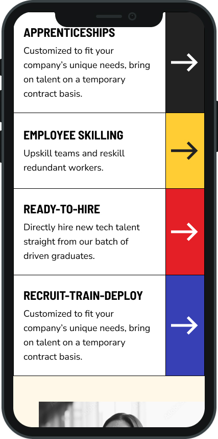
VISUAL DIFFERENTIATION BETWEEN B2B & B2C
A key challenge was making the B2B and B2C sites feel distinct while maintaining a cohesive brand system. Initially, we differentiated primarily through color and imagery:
However, despite these visual differences, the client felt the distinction wasn't strong enough. To push the B2C site further, we replaced the cream background with a light grey from their design system. This seemingly simple change created a noticeable tonal shift - the grey allowed the brighter tertiary colors to pop and gave the B2C site a more energetic, modern feel.

CHALLENGE
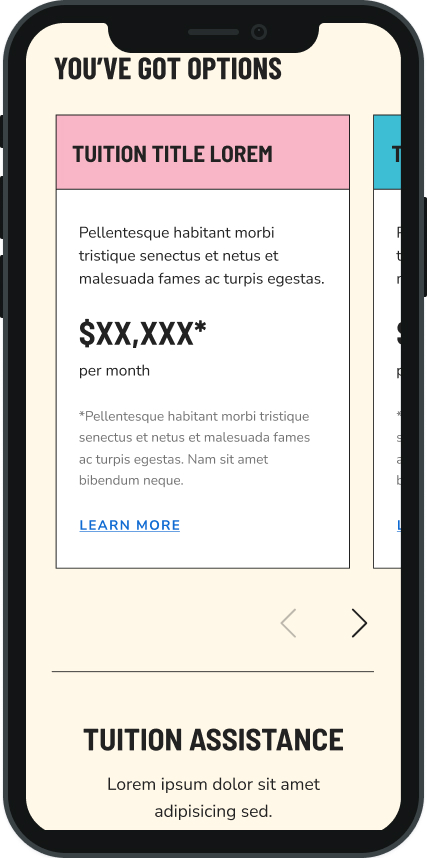
Another challenge was visualizing a dense section n financing options for the B2C side. The content was copy-heavy, and early explorations using a card-based layout felt awkward on desktop and too bulky on mobile.
SOLUTION
We shifted to an accordion design, which allowed us to preserve clarity without overwhelming users. It also gave us an opportunity to play with color while reusing an element already approved from the B2B site.
REFLECTION
CHALLENGES AND SOLUTIONS
WHAT I LEARNED
Adaptability is key — When the client seemed impatient with research, we pivoted quickly into visual exploration without skipping the foundational work we still needed.
Visual nuance can shift perception — Small changes (like background colors or content hierarchy) can have a big impact in creating distinct experiences for different user groups.
Collaboration is both internal and external — Working in a large team while managing diverse client voices taught me how to balance feedback, clarify decision-making, and keep forward momentum.
WHAT I'D DO DIFFERENTLY
Build in visual differentiation strategy earlier — Knowing that the client expected a stronger contrast between B2B and B2C, we could’ve planned for more foundational layout or interaction differences in addition to color.
Introduce user validation sooner — Even informal user testing during early design rounds might have helped us feel more confident navigating internal feedback and deciding when something was “done.”