
Bridging Usability and Detail:
Elevating UX for Scientific Ecommerce
Team: Associate UX Director, Senior UX Designer, Associate UX Designer (me)
Task: Comprehensive website redesign for one of the world's largest healthcare manufacturing organizations
Timeline: November 2022 - March 2023
Tools: Figma, Mural
Overview
As part of a two-person UX design team, I worked on a comprehensive redesign of a website for one of the world's largest healthcare manufacturing organizations. Specifically, updating their Bioscience division to reflect the main website's updated branding and improve key user flows. The website serves a highly specialized audience of scientists and pharmaceutical professionals, so our focus was on making dense, technical content more accessible while streamlining the experience across desktop and mobile.
CHALLENGE
This company’s users aren’t your typical e-commerce shoppers. They require detailed product specifications, downloadable documentation, and the ability to search by exact catalog numbers. The challenge was to present all this data in a way that was organized, easy to scan, and aligned with modern usability standards, all without overwhelming the user.
MY ROLE
I collaborated closely with a Senior UX Designer, and together we owned the entire design process from strategy to high-fidelity mockups. I also stepped into a lead role during client meetings when the Senior Designer was unavailable, presenting progress and gathering feedback. I worked primarily in Figma for design and Mural for collaborative mapping and presentation. Approved designs were organized into a shared client-facing Figma folder for easy access and version control.
Design Process
We met weekly with stakeholders to review designs, gather feedback, and align priorities. I led client calls when the Senior UX Designer was unavailable and ensured all final designs were organized in a shared Figma folder for easy access and review.
We also incorporated feedback from employees and internal experts who use the site regularly, which helped validate design decisions and shape user priorities.

We divided the work into six “drops,” each covering a specific section of the site. Each drop followed a 3–4 week cycle that included wireframing, stakeholder reviews, design iterations, and hi-fidelity mockups.
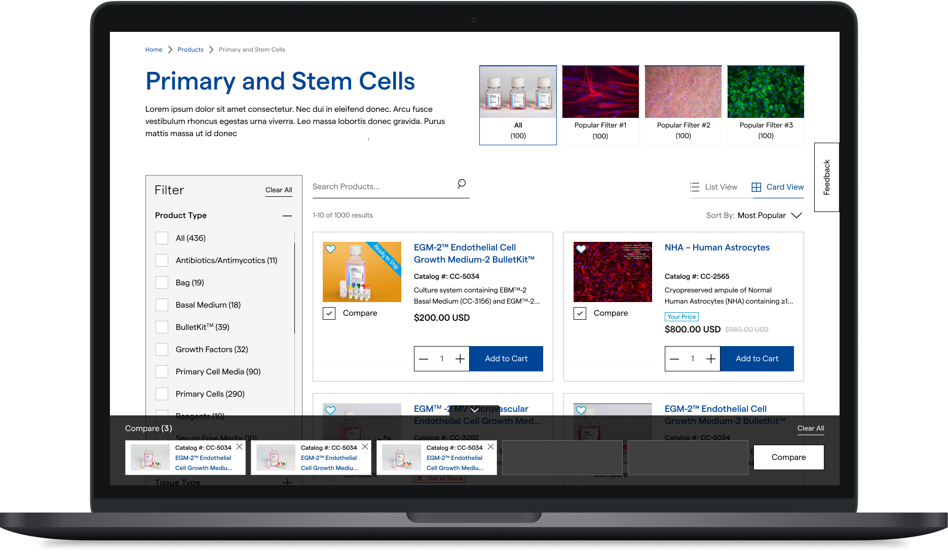
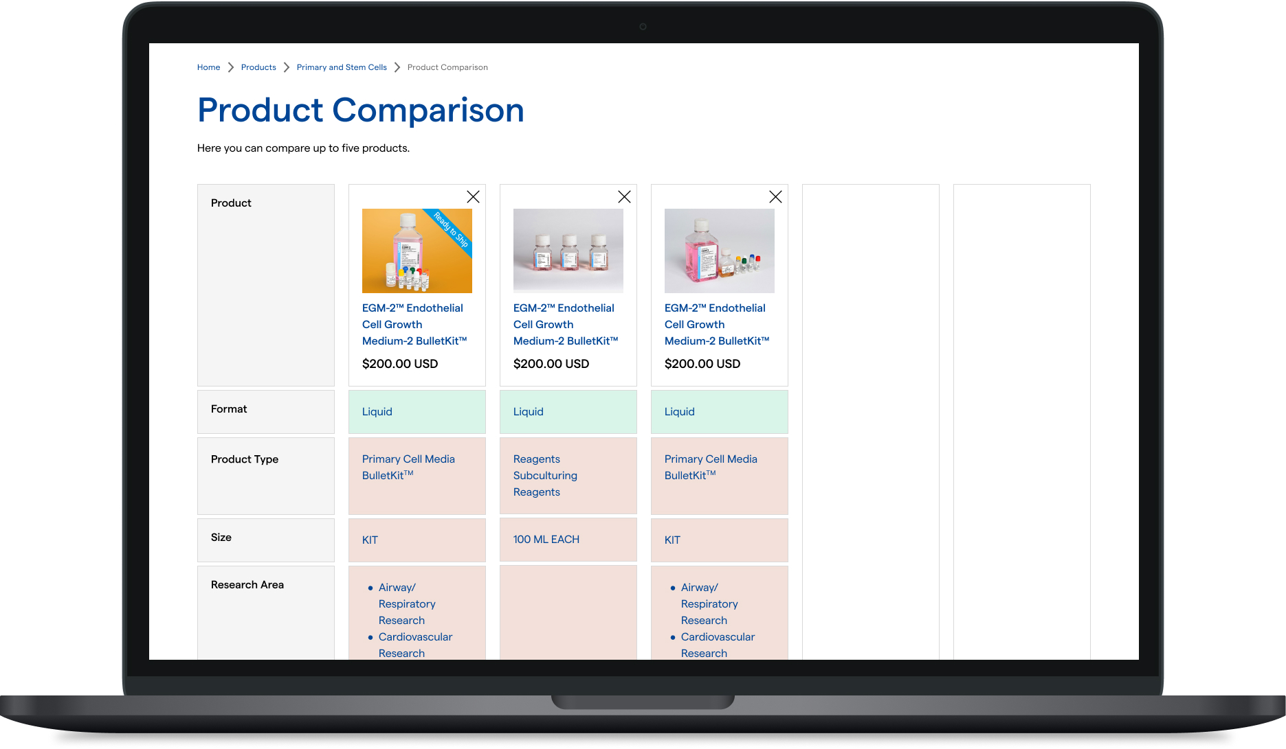
DROP 1: Product List Page (PLP)
The product card needed to show a large amount of information at a glance: image, title, description, catalog number, price, quantity selector, compare and favorite buttons, and an add-to-cart option.
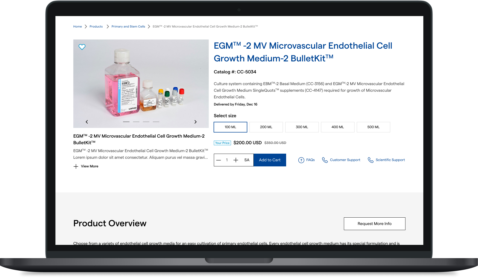
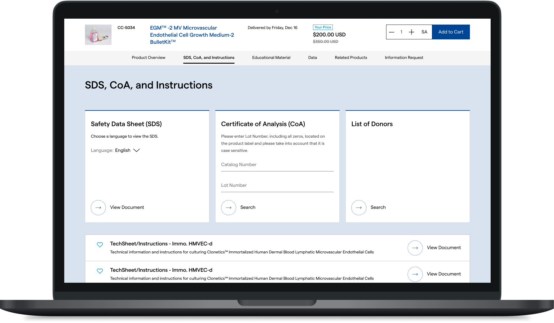
DROP 2: Product Detail Page (PDP)
We structured the PDP using tabbed sections to include product details, documentation, catalog-specific views, and related products. We emphasized quick access to technical documents and spec sheets, which were a top priority for users.
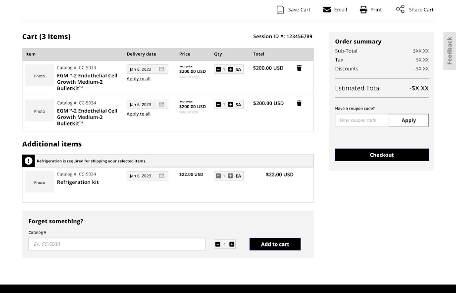
DROP 3: Cart & Checkout
We streamlined the add-to-cart and checkout process, ensuring that even with complex products and varying quantities, the experience remained intuitive on both desktop and mobile.
DROP 4: Self Service & My Account
Focused on giving users more control: order history, saved documents, favorite products, and reordering tools — all tailored to power users working in labs or research facilities.
DROP 5: Navigation, Homepage, & Search
With a vast catalog and multiple product categories, we designed a navigation system that balanced our client’s internal hierarchy with clear, intuitive paths for users. We also aligned our work with the overarching structure of their parent company’s site.
DROP 6: Email Notifications, Articles, & Favorites
We designed lightweight interfaces for personalized site content, enabling users to save and return to research articles, products, and documentation with ease.
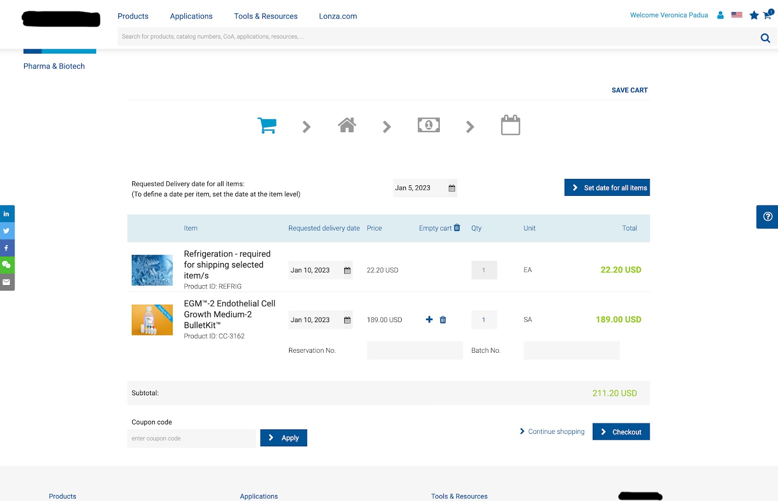
Previous Design
Wireframe
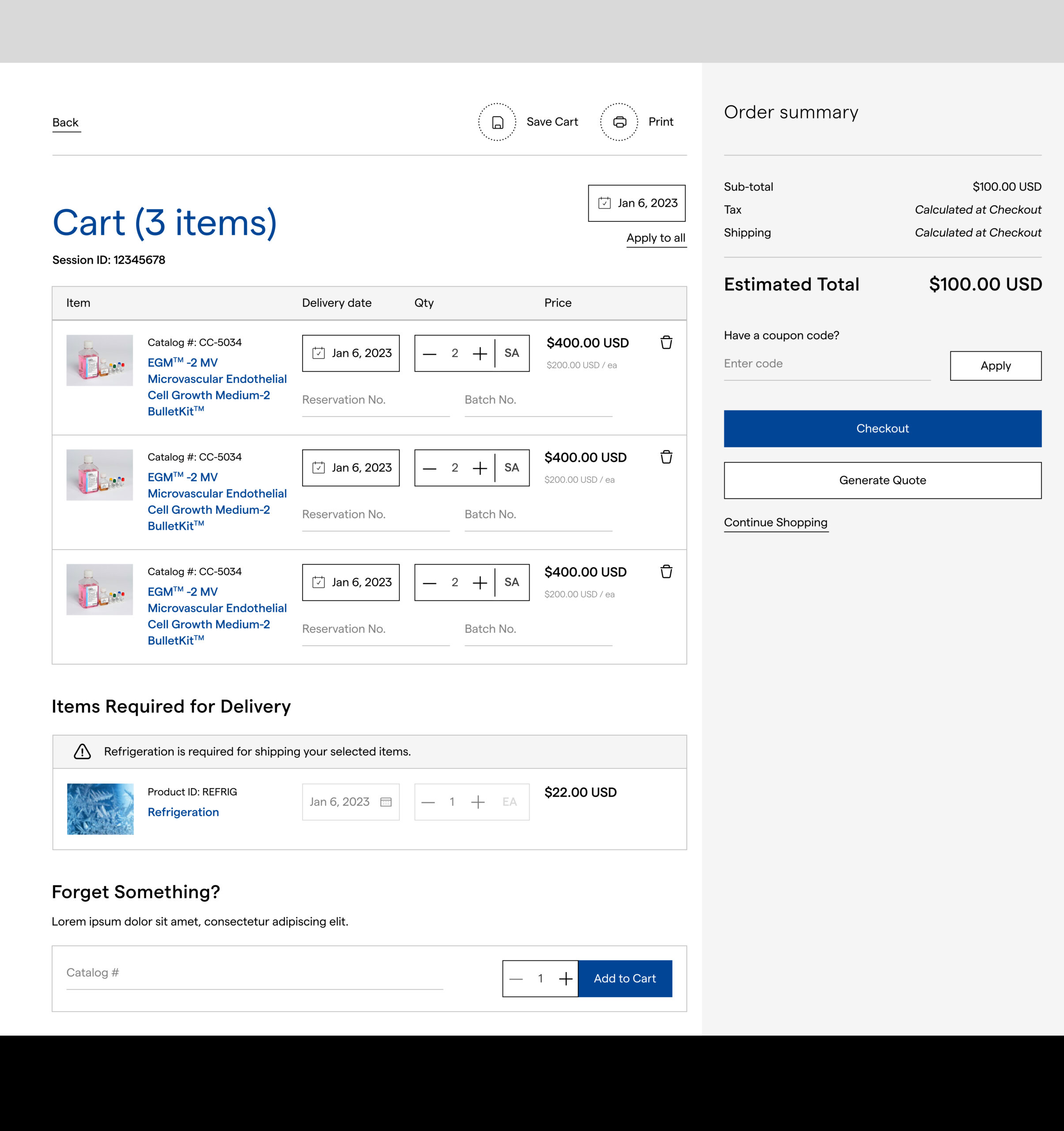
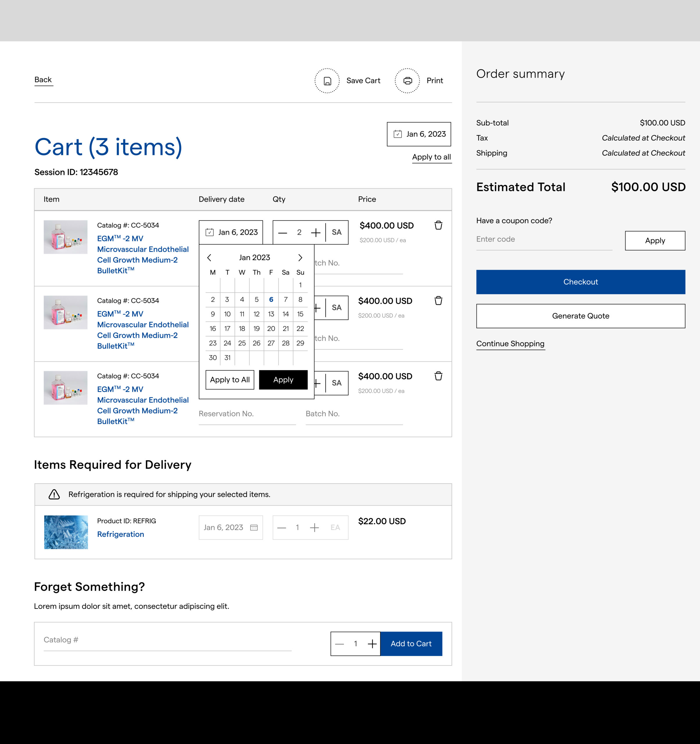
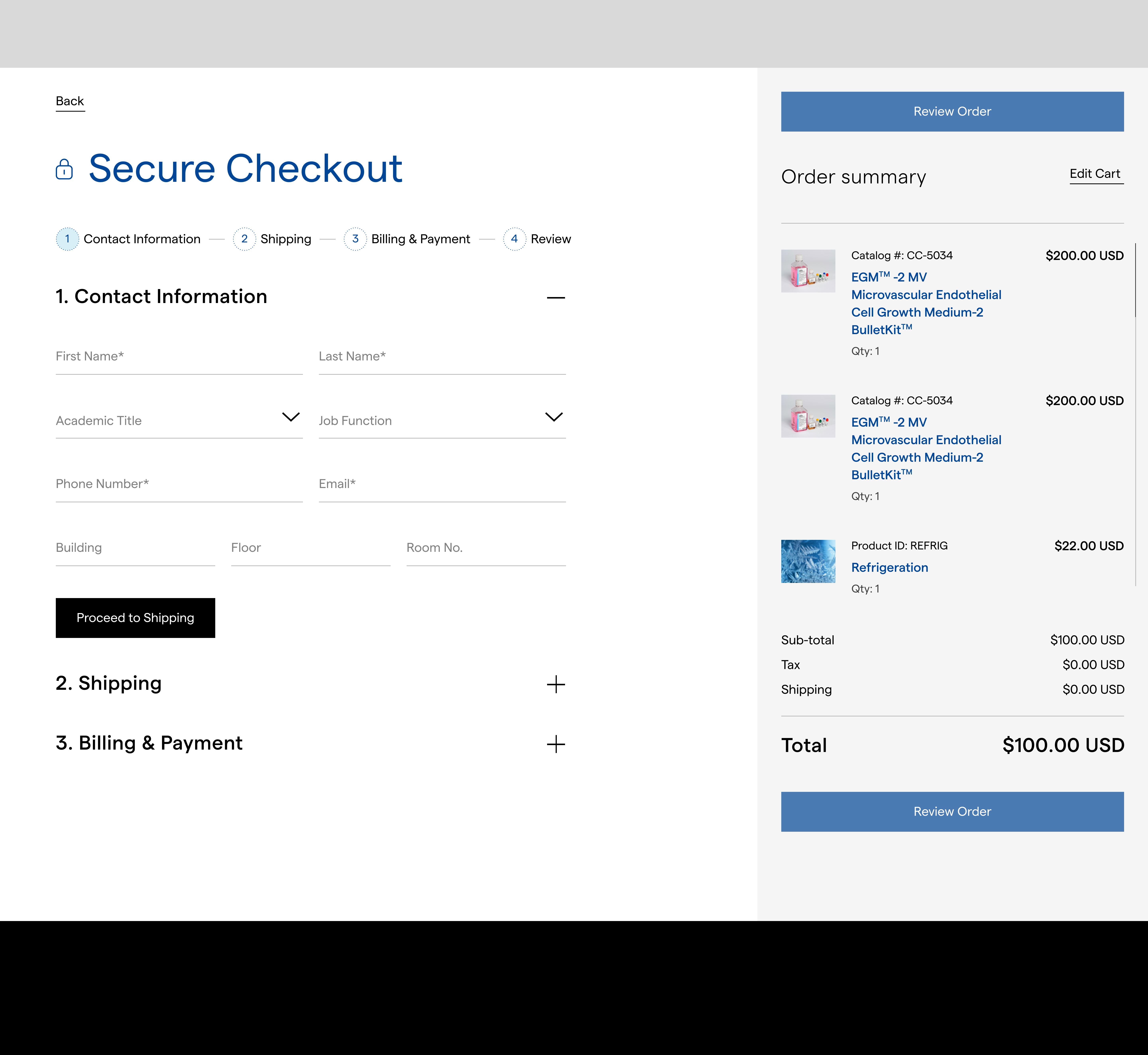
High-fidelity designs for cart and checkout
Challenges & Solutions
Key Takeaways
Effective UX for specialized audiences is built on empathy, strategic information architecture, and close collaboration with client stakeholders